The project
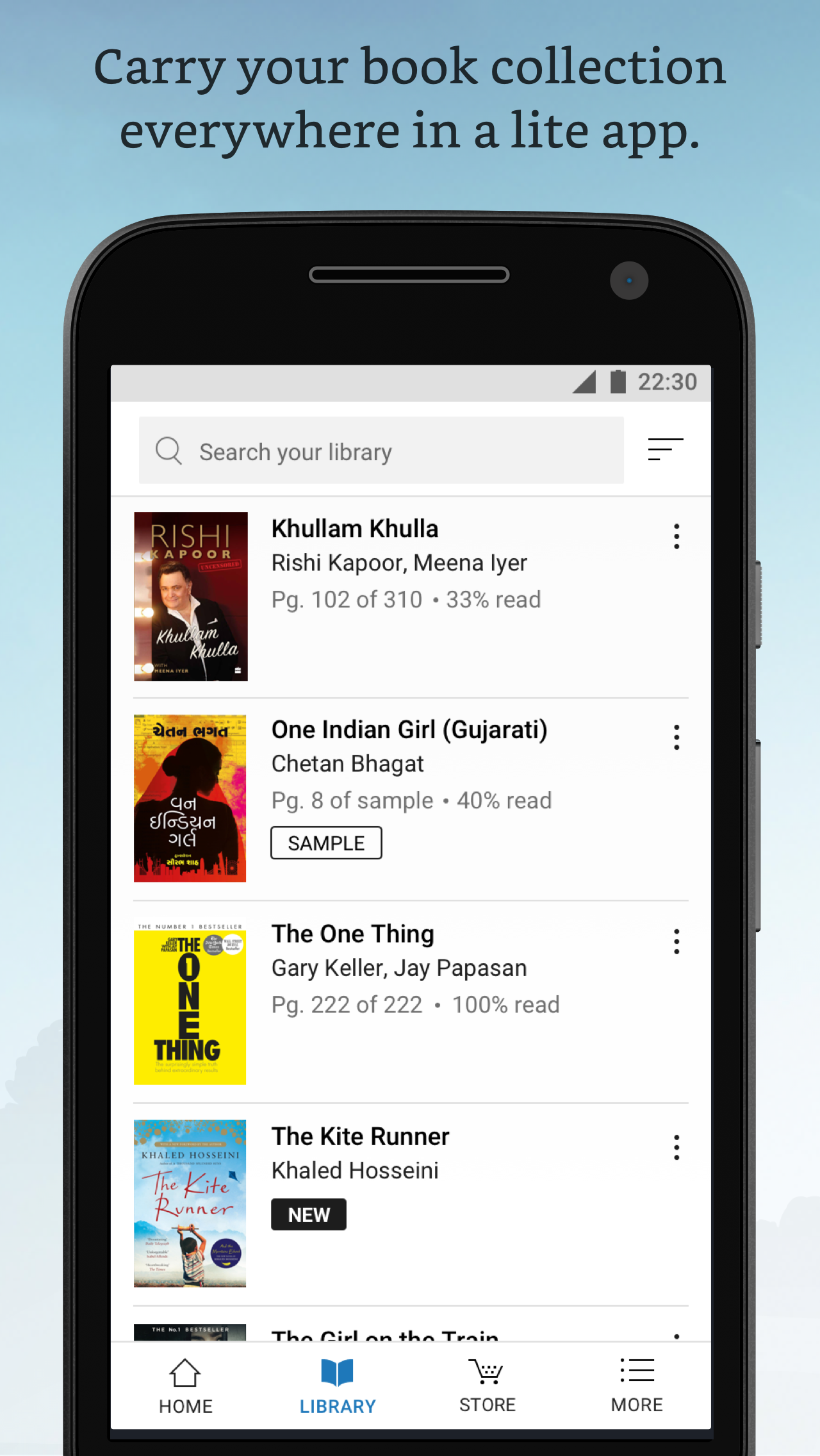
Kindle Lite is a new Android app designed to make mobile reading accessible to those with low-storage phones and spotty networks. It has so far been released in Early Access in India.
My role
Owner: UX/UI design, user testing, visual design, exploratory research, naming surveys, copy-writing, long-term vision.
Co-owner: Feature definition, branding, QA.
Learning themes
Using strict constraints as opportunities to innovate.
Android mobile design.
International design.
The process
I’ve omitted and obfuscated confidential information in this case study. All information here is my own and does not necessarily reflect the views of Amazon.
1 | Setting the vision
To kick off the project in March 2016, I planned and facilitated a 3 day design sprint with our newly-formed project team. During that process, we set a 1-year goal together, developed key customer archetypes, mapped the customer journey, and sketched solutions and storyboards.
I then adapted the sketches and storyboards and developed an InVision prototype of the app experience, from discovery through repeated use.
The prototype communicated the 'north star' vision of the app using mid-fidelity wireframes of key customer experiences. I presented that prototype up through VP leadership and it quickly became our point of reference for the future development of the project.
2 | Designing for beta
Throughout the design process for Kindle Lite, I followed four main strategies:
Listening to readers. Starting with a limited feature set allows us to test and understand what is important to our customers through research and feedback.
Learning from Kindle. I was able to draw on 10 years of lessons about what does and doesn’t work for digital readers.
Asking constantly, how would we do this if we were truly starting from scratch?
Working with constraints. This entailed very close collaboration with the development team to deliver the best value within our technical constraints, including very limited app space, new architecture, old OSes, and complex offline cases.
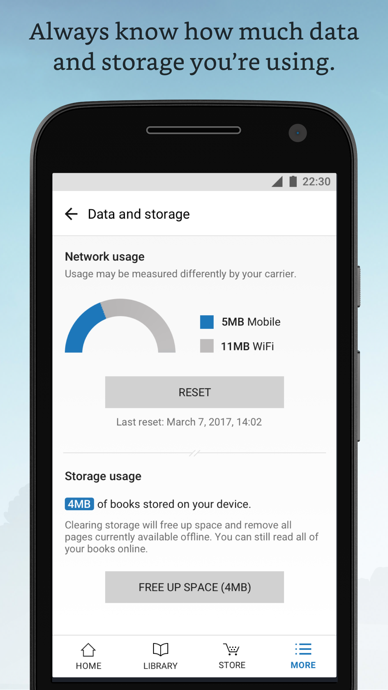
The visual design was based on the Kindle UI guidelines and colors, but adapted to use only system fonts, small SVGs, and simple animations.
Simple, fast-loading UI.
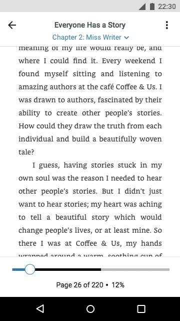
New-to-Kindle interaction patterns.
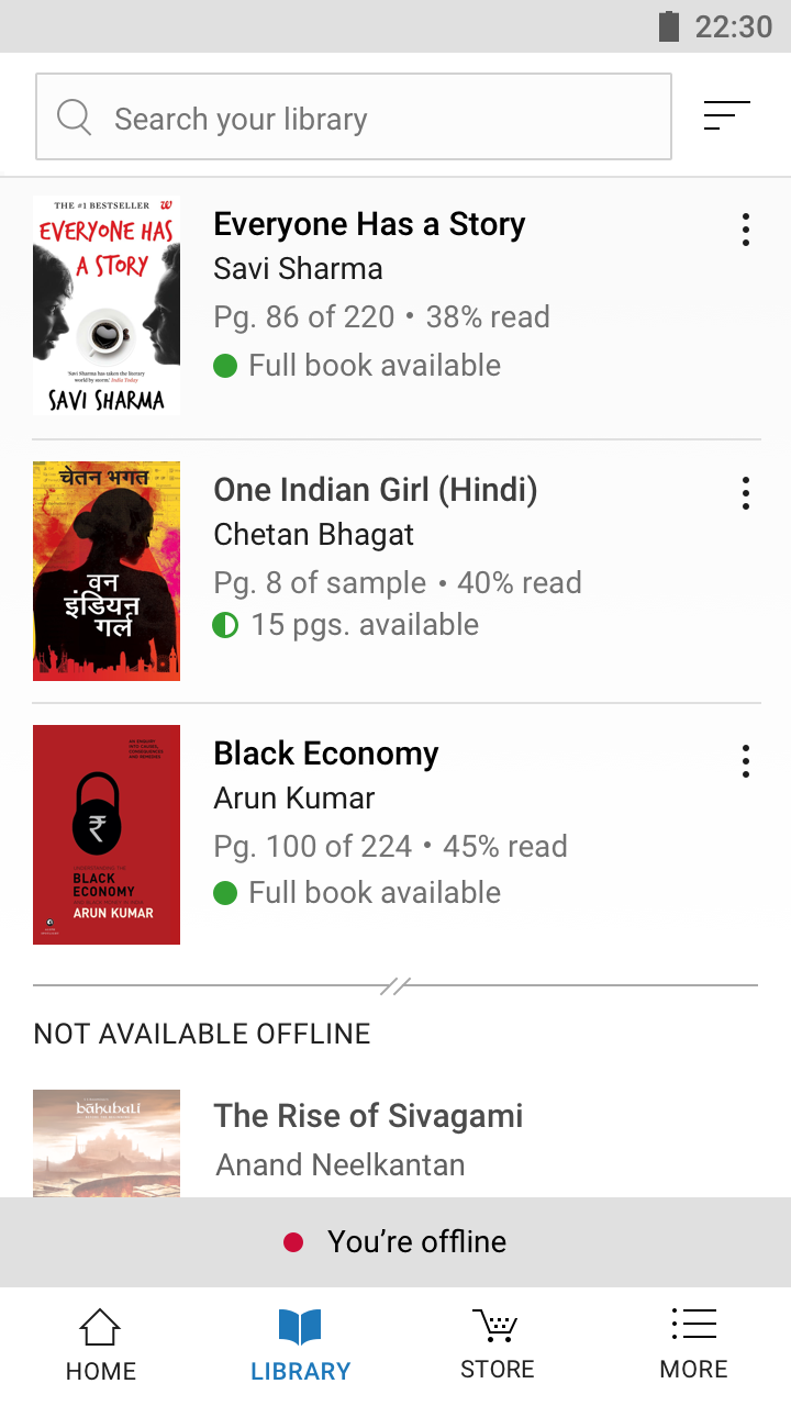
Robust system of offline and error states to accomodate our loading model and spotty networks.
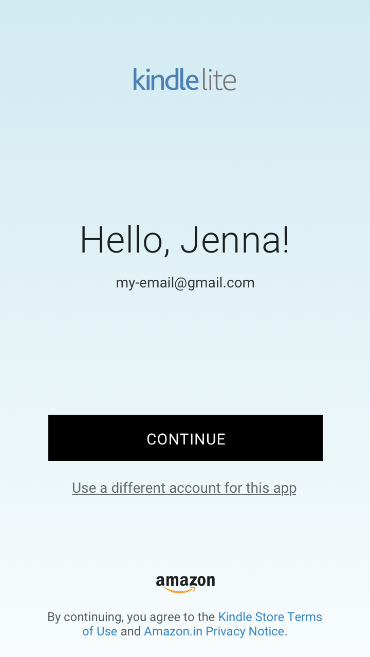
3 | Branding and launching
To propose the recommended app name, I created a Qualtrics survey and distributed it to thousands of participants in India to understand the traits they associated with several potential app names.
I also collaborated with the Kindle brand designer to develop the icon and logo. After designing the Google Play screenshots, we were ready to launch our beta in October 2017!


4 | More researching and iterating...
During beta, I planned a diary study and usability test with participants in two Indian cities. I observed the sessions in India, and worked with our partner agency to analyze the findings. I presented them to the team along with recommendations to translate those findings into improved designs, tenets and features for the future of the app.
Sharing
After beta release and user testing, I spoke about the app at the Kindle org all-hands event.
It was a great opportunity to synthesize our process and share what we've learned over the last year.